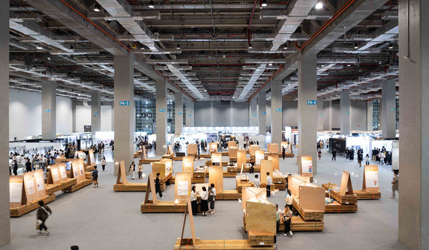
 Golden Pin Salon 2025 in Kuala Lumpur: Taiwan–Malaysia Design Dialogue in the Age of AI
Golden Pin Design Award
2025-05-06
Golden Pin Salon 2025 in Kuala Lumpur: Taiwan–Malaysia Design Dialogue in the Age of AI
Golden Pin Design Award
2025-05-06
Golden Pin Salon 2025 in Kuala Lumpur: Taiwan–Malaysia Design Dialogue in the Age of AI
Golden Pin Design Award
2025-05-06
Golden Pin Salon 2025 in Kuala Lumpur: Taiwan–Malaysia Design Dialogue in the Age of AI
Golden Pin Design Award
2025-05-06
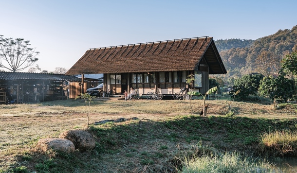
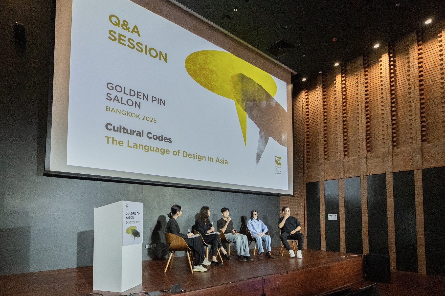 Golden Pin Salon 2025 Bangkok Recap: A New Chapter in Taiwan–Thailand Design Exchange
Golden Pin Design Award
2025-05-06
Golden Pin Salon 2025 Bangkok Recap: A New Chapter in Taiwan–Thailand Design Exchange
Golden Pin Design Award
2025-05-06
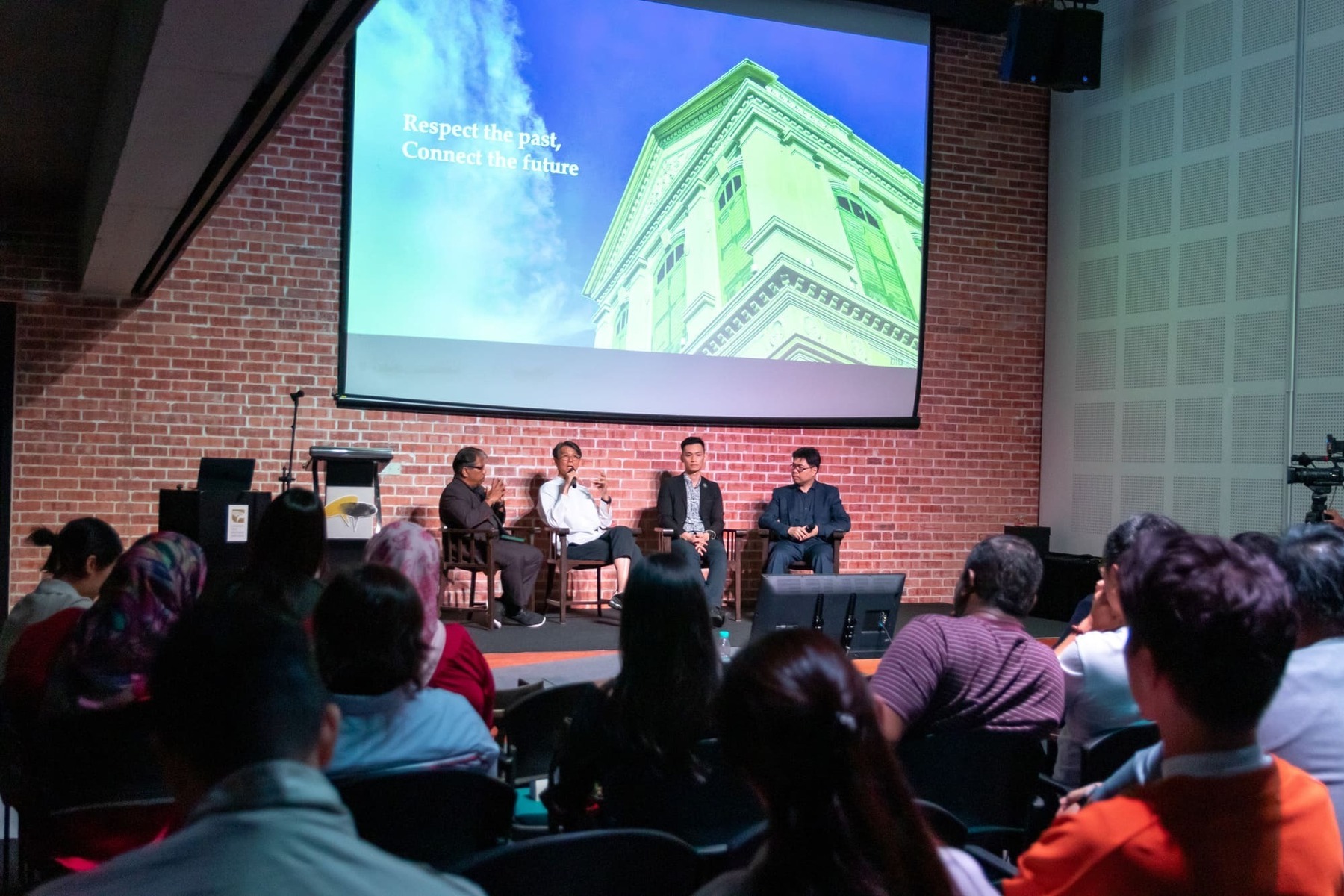
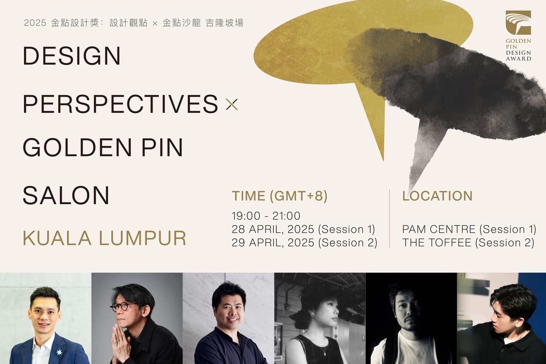 Golden Pin Salon to Conclude 2025 Asia Tour in Kuala Lumpur on April 28–29, Highlighting Creativity and Cultural Heritage in the Age of AI
Golden Pin Design Award
2025-04-16
Golden Pin Salon to Conclude 2025 Asia Tour in Kuala Lumpur on April 28–29, Highlighting Creativity and Cultural Heritage in the Age of AI
Golden Pin Design Award
2025-04-16