WEN DAU MULLET ROE
-
CategoryCommunication Design
-
SubCategoryPackaging
-
Applicant Company#TO_C studio / Taiwan
-
Manufacturer / Business OwnerWen Dau When Fresh / Taiwan
-
Design Company#TO_C studio / Taiwan
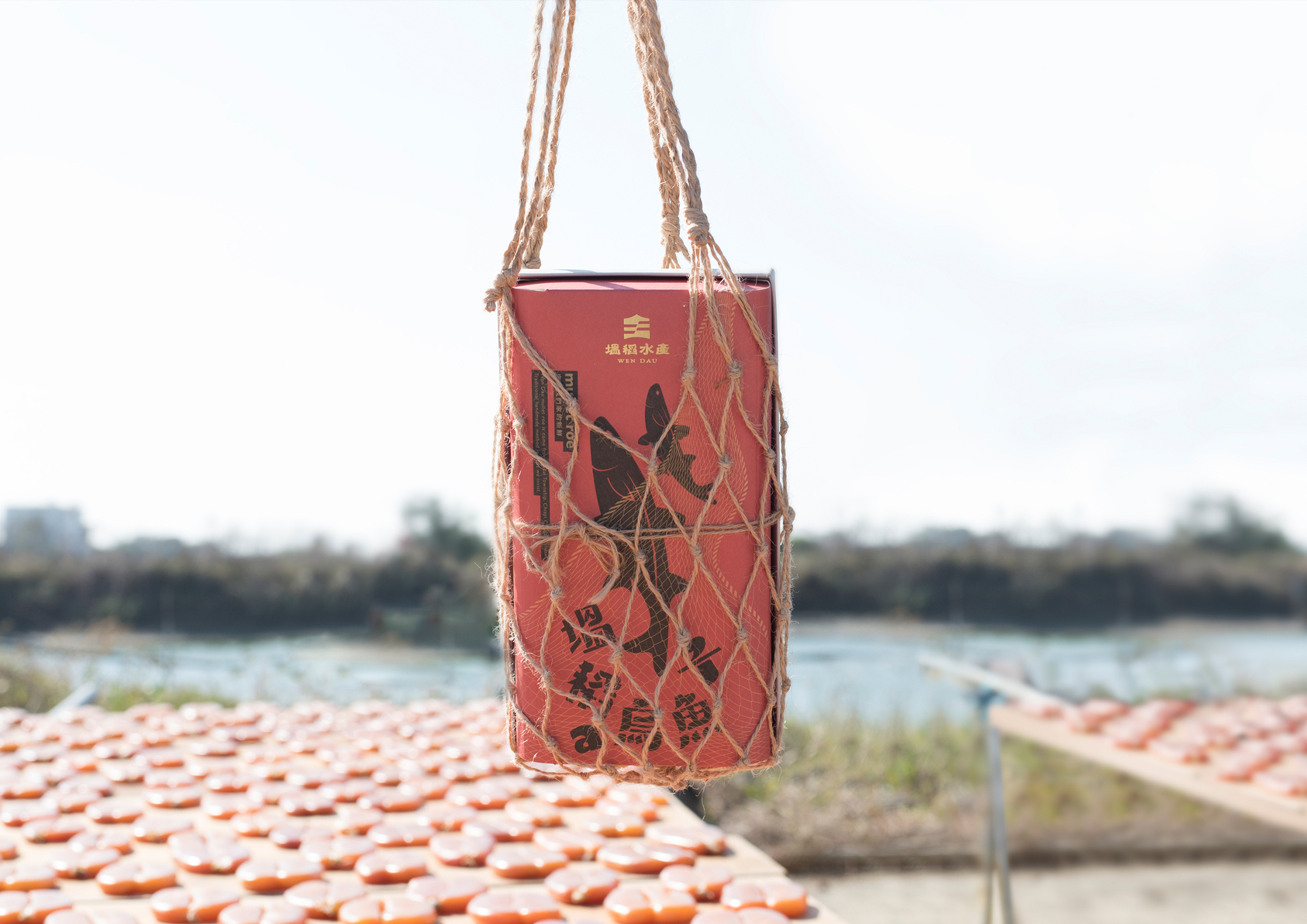
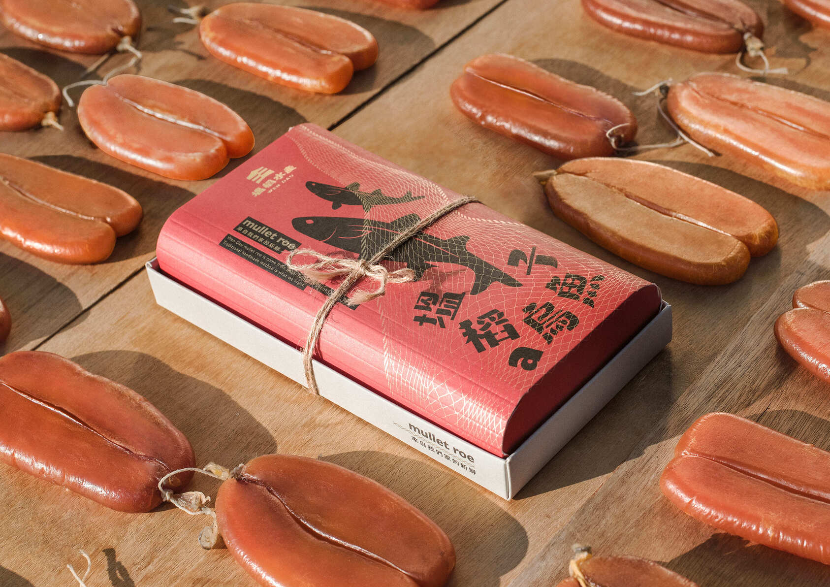
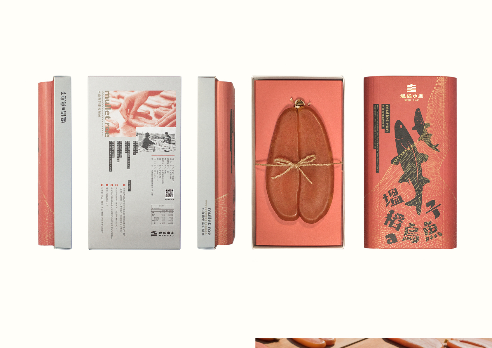
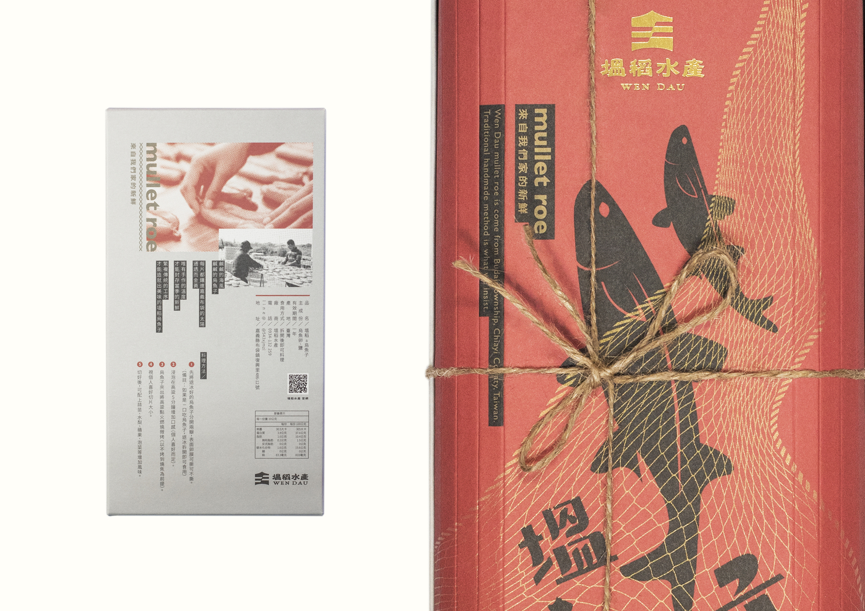
Wen Dau, a local fishery in Chiayi Budai, is known for their fresh, self-produced seafood. They aim to promote their high-quality fish products through design, hoping to reach more people.
The design concept is centered around the idea of "freshness is determined by how well a fish jumps". The image is designed with the concept of catching mullet, capturing both the product name and the image of the mullet, making the visual interaction more interesting. The reading order of the standard font makes the text come alive like a living creature.
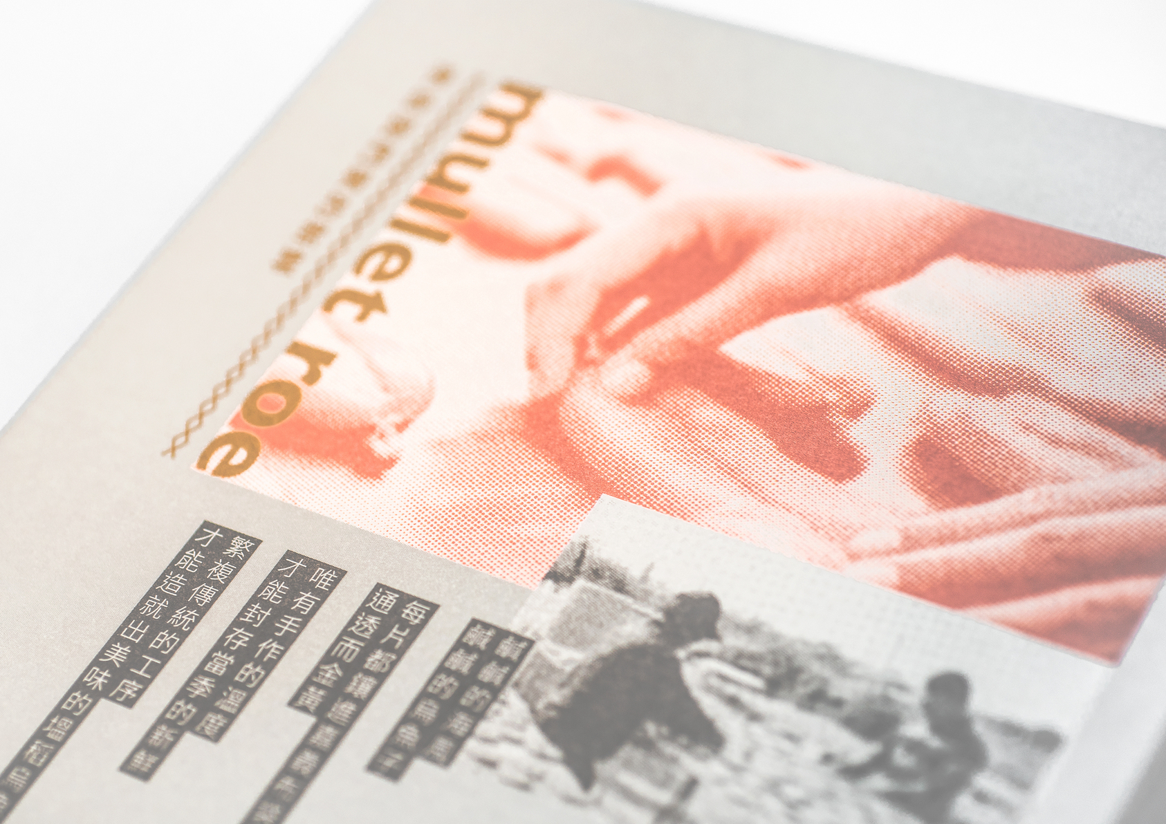
In terms of printing, in addition to using special gold and hot stamping, the fishnet pattern adopts screen printing, and at certain angles, it presents a dazzling gold effect, just like a real fishing net, sometimes transparent and sometimes obvious.
The box design aims to match the characteristics of the contents, with rounded corners inspired by the plumpness of mullet roe. The paper material was chosen to withstand frozen home delivery and features a stiffening effect with thick paper. The curved parts require fold lines to facilitate better shaping during packaging.