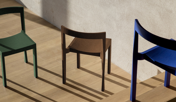
 2025金點設計獎「最佳設計成就獎」即日起開放各界推薦至7月2日
金點設計獎
2025-06-05
2025金點設計獎「最佳設計成就獎」即日起開放各界推薦至7月2日
金點設計獎
2025-06-05
2025金點設計獎「最佳設計成就獎」即日起開放各界推薦至7月2日
金點設計獎
2025-06-05
2025金點設計獎「最佳設計成就獎」即日起開放各界推薦至7月2日
金點設計獎
2025-06-05
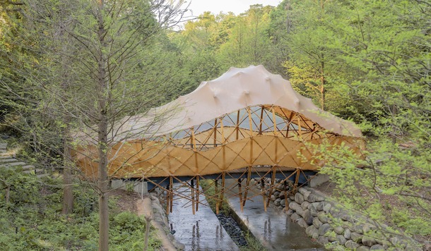
 2025金點設計獎第六屆評選研習實作營招募中!即日起開放報名至7/21
其他、金點設計獎
2025-05-26
2025金點設計獎第六屆評選研習實作營招募中!即日起開放報名至7/21
其他、金點設計獎
2025-05-26
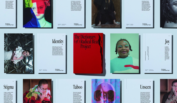
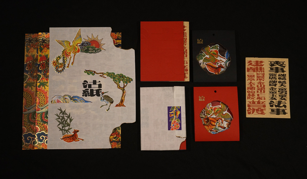
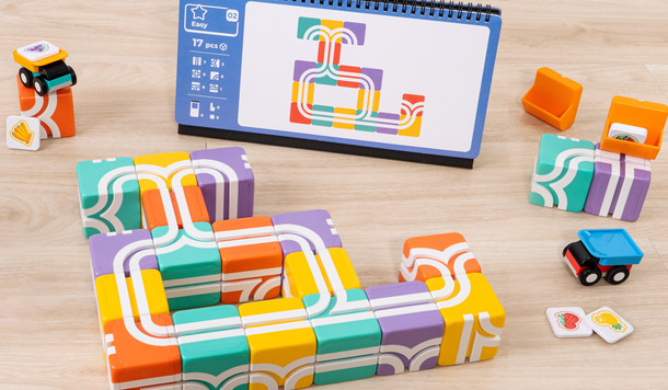
 2025金點新秀設計獎揭曉得主,展現新世代設計實力!
金點新秀設計獎
2025-05-11
2025金點新秀設計獎揭曉得主,展現新世代設計實力!
金點新秀設計獎
2025-05-11