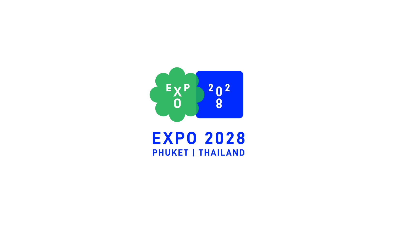
Expo 2028 Phuket Thailand
-
CategoryCommunication Design
-
SubCategoryCorporate and brand identity
-
Applicant CompanyPink Blue Black & Orange / Thailand
-
Manufacturer / Business OwnerTCEP / Thailand
-
Design CompanyPink Blue Black & Orange / Thailand
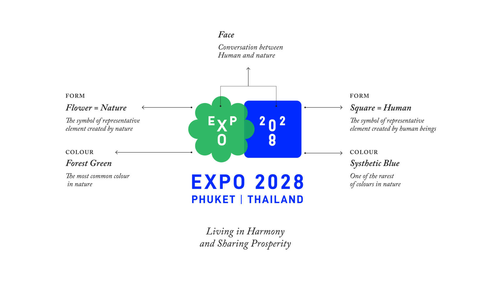
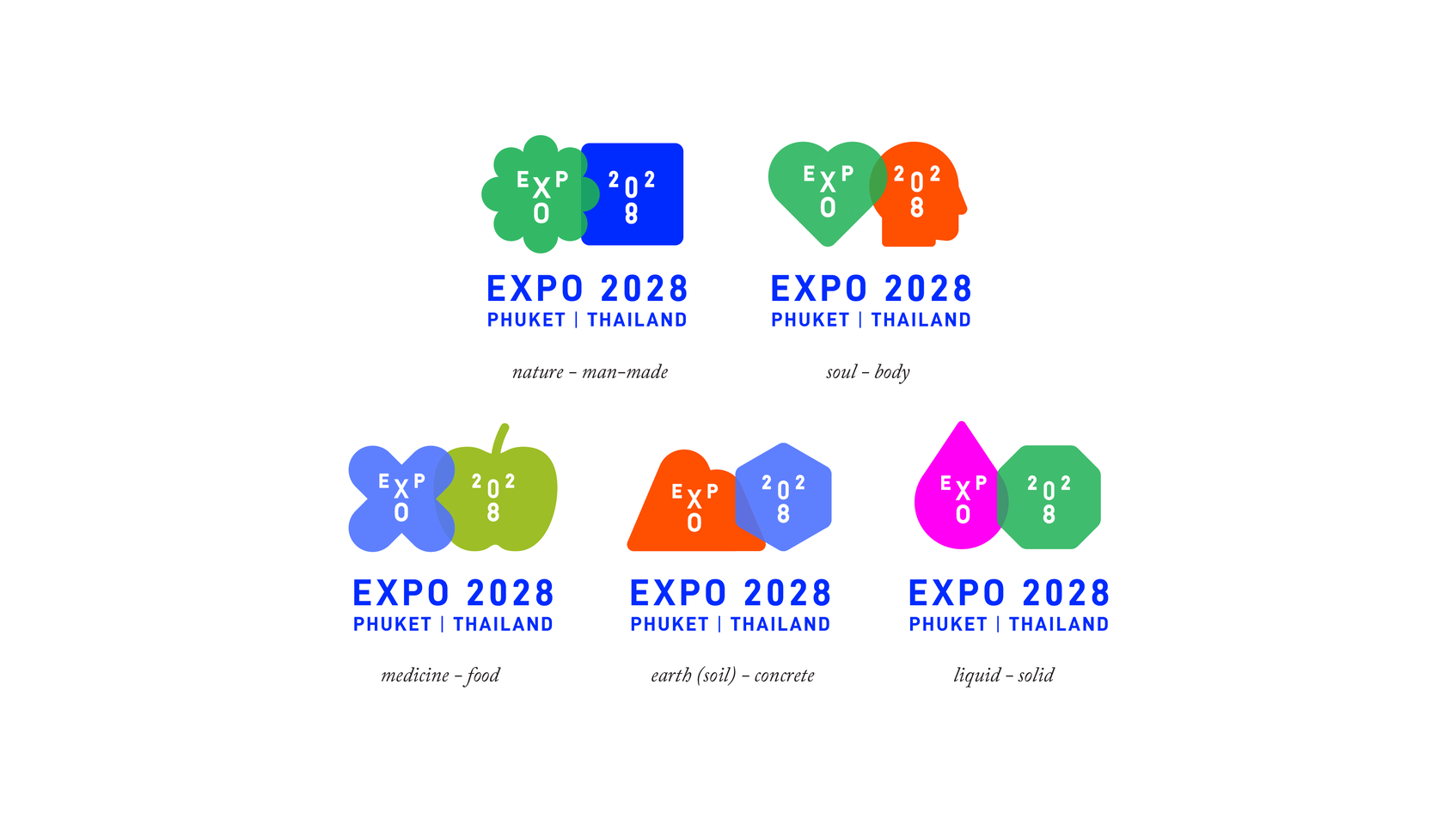
The Phuket EXPO 2028 logo symbolises the peaceful coexistence between nature and man as well as the Yin-Yang concept of balance, and is a graphic summary of the EXPO’s theme Future of Life – Living in Harmony, Sharing Prosperity.
Why Human & Nature? We believe our world is interdependent. In Eastern philosophy and the concept of Yin and the Yang, things that appear to be the opposite of each other may also be complementary, and that the whole can be greater than the sum of its parts.
The logo illustrates the essential balance and harmony in life – between human and nature, East and West, technology and tradition, mental and physical, etc. This is achieved through two simple graphic symbols. The green flower represents natural factors, such as forests and the ecosystem, while the blue square represents man-made factors, such as technology and developments. The two shapes are marked with alphabets and numbers that spell out EXPO 2028 in an arrangement that suggests two human faces.