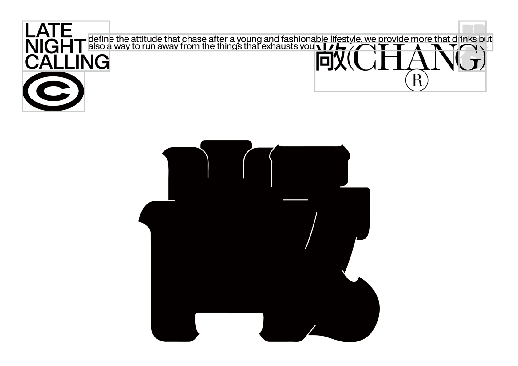
CHANG
-
CategoryCommunication Design
-
SubCategoryCorporate and brand identity
-
Applicant CompanyYIMEDUO Design / China
-
Manufacturer / Business OwnerChengdu dalijiujiu management Co., LTD / China
-
Design CompanyYIMEDUO Design / China
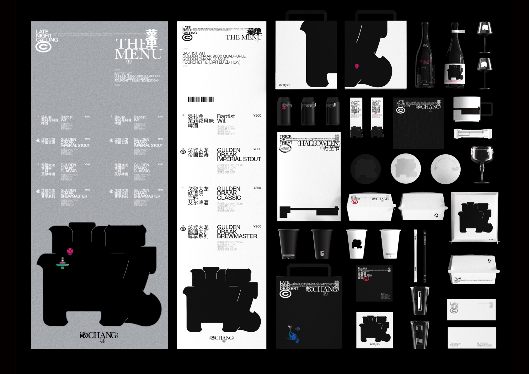
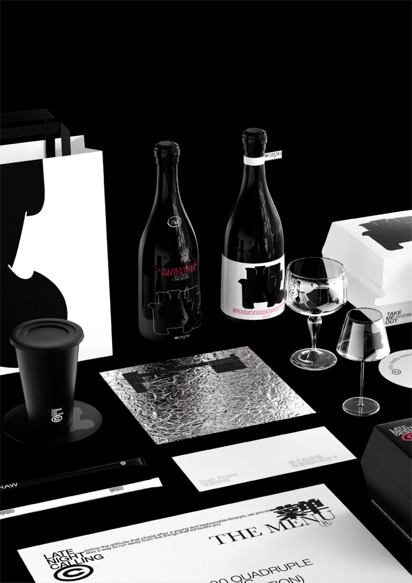
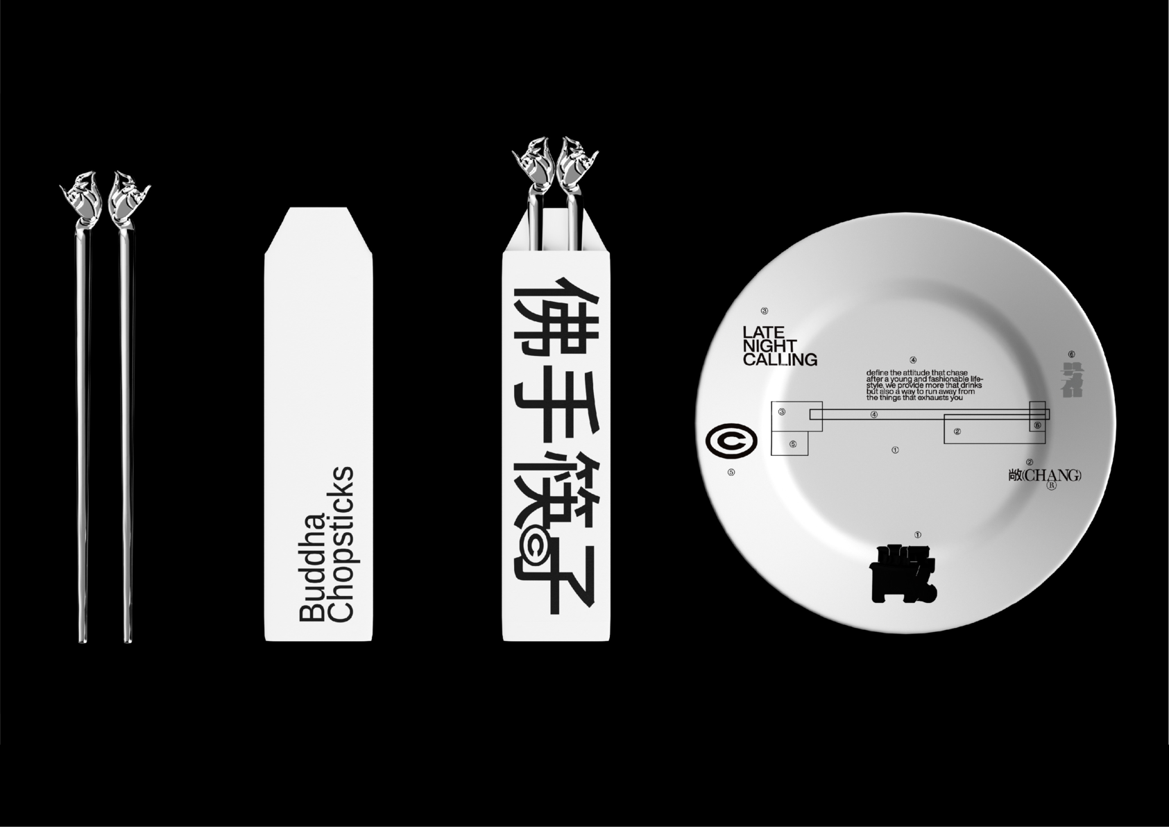
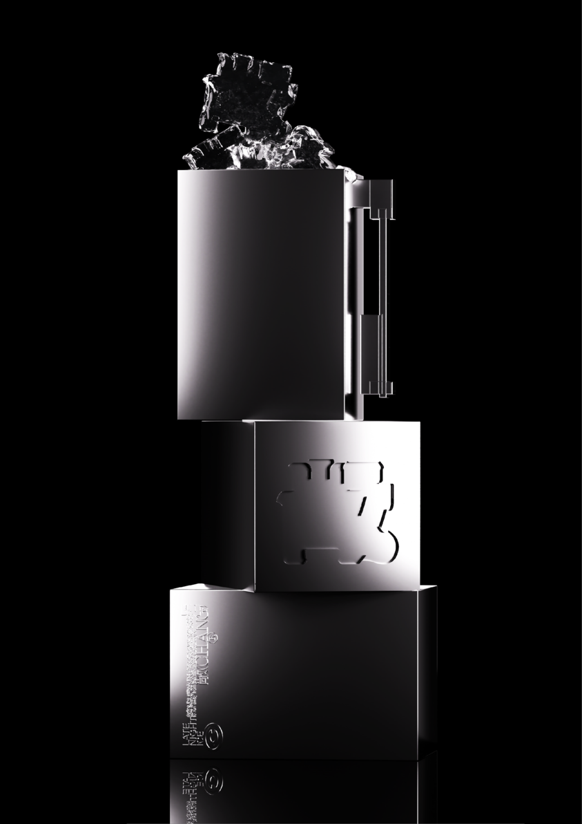
Most of the bars that highlight the serving of craft beer render a modern visual effect on the whole, which visual experience is single-threaded and indurated. “敞”(CHANG), however, is more adventurous. We want “敞” to be not only a commercial space, but also a place for ideas to exchange, where we may experience both traditional and avant-garde arts. We want the contemporary expression of Chinese aesthetics to infiltrate invisibly the cognition of individuals. This inclusive and spiritual atmosphere also encourages people therein to think farther and deeper, and to let their voices be heard in a broader area.The nature of “敞” as a bar allows it to drift away from the reality and routine. Alcohol releasing the overflow of more profound language or emotions. On top of this, we transform different things in “敞” into the gems inlaid in a treasure box. As for the extraction of typography, it’s the specific expression that jumps off the frame and gets straight to the core. It is like a weapon, or a key; in a way gentle or sharp, it turns all individuals here towards everything and also their own hearts. In this project, we discuss the metaphorical relationship between words and symbols in contemporary graphic design, hoping to achieve a purely symbolic state through textual presentation, and to construct a new "stacking aesthetic". also display boldly the typography skeleton composed of various blocks, stacking, extruding, stretching, generating a new visual symbol. This symbol permeates all the images and forming a thorough interpretation of “敞”.