

PTS+ Rebranding
MARK WINNER
-
CategoryCommunication Design
-
SubCategoryCorporate and brand identity
-
Applicant CompanyWHITELIGHT MOTION CO., LTD. / Taiwan
-
Manufacturer / Business OwnerTaiwan Public Television Service Foundation / Taiwan
-
Design CompanyWhitelight Motion / Taiwan
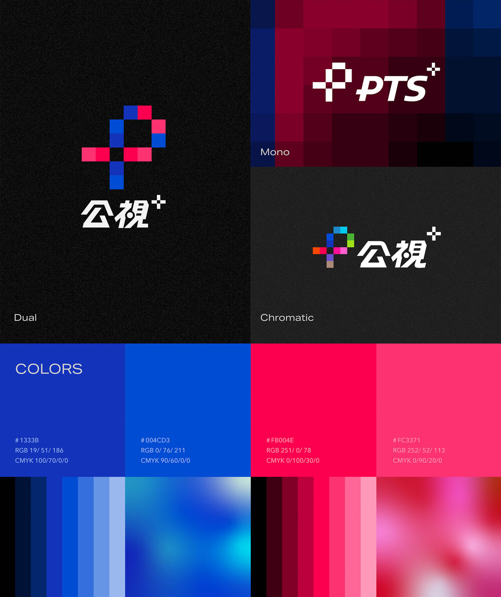
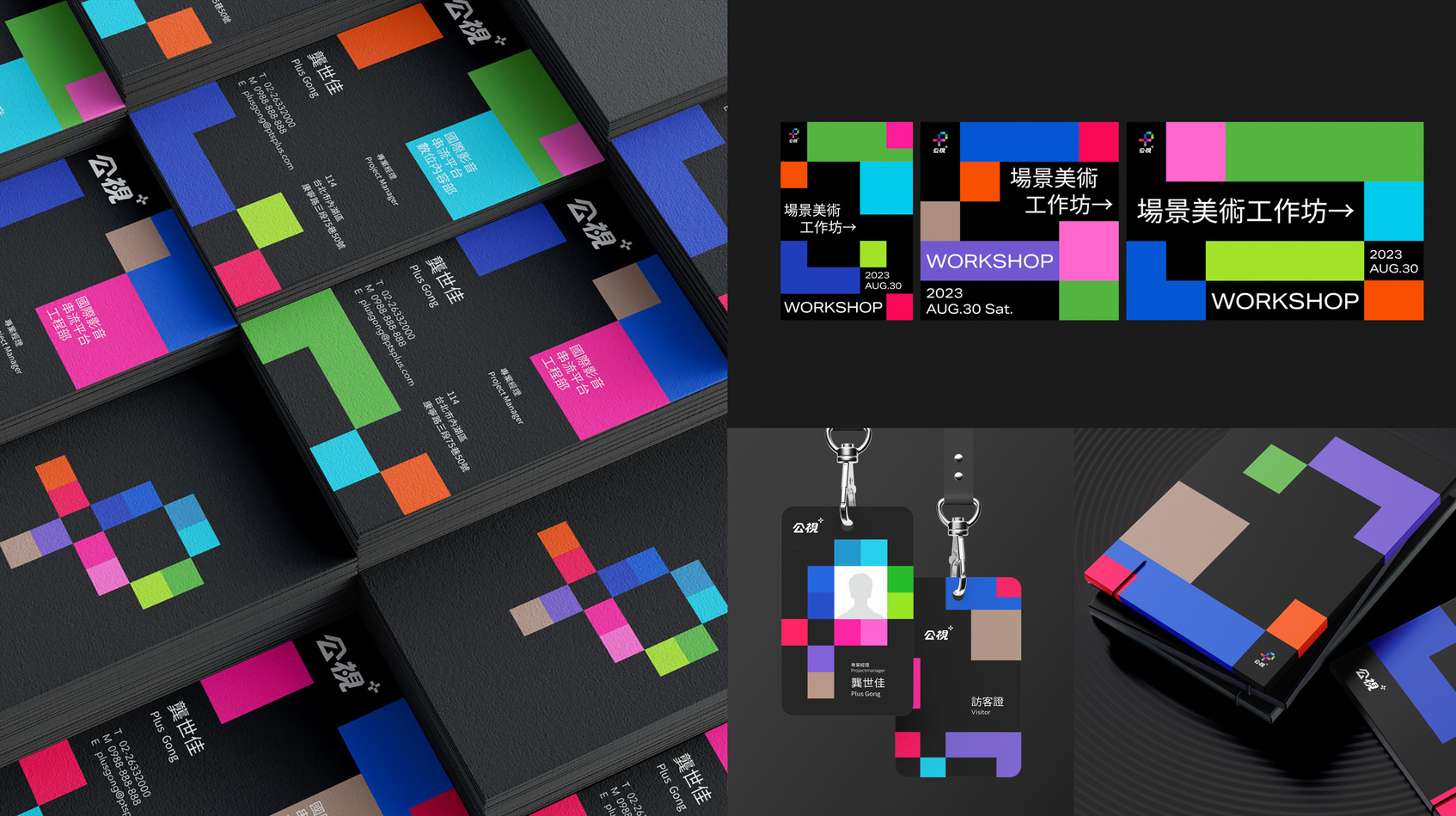
The rebranding of the PTS+ streaming brand conveys the core spirit of "Decoding Digital Vision." The brand identity is composed of pixels, symbolizing a focus frame, reflecting attention to diverse and profound visual content. Addressing its dual role towards both audience and industry, the brand further develops B2C identity "Dual" and B2B identity "Chromatics."
Other winning works