Re-Route Festival
-
參賽類別傳達設計類
-
參賽組別出版品
-
申請公司PLUS Collaboratives / 新加坡
-
廠商/業主PLUS Collaboratives / 新加坡
-
設計公司PLUS Collaboratives / 新加坡
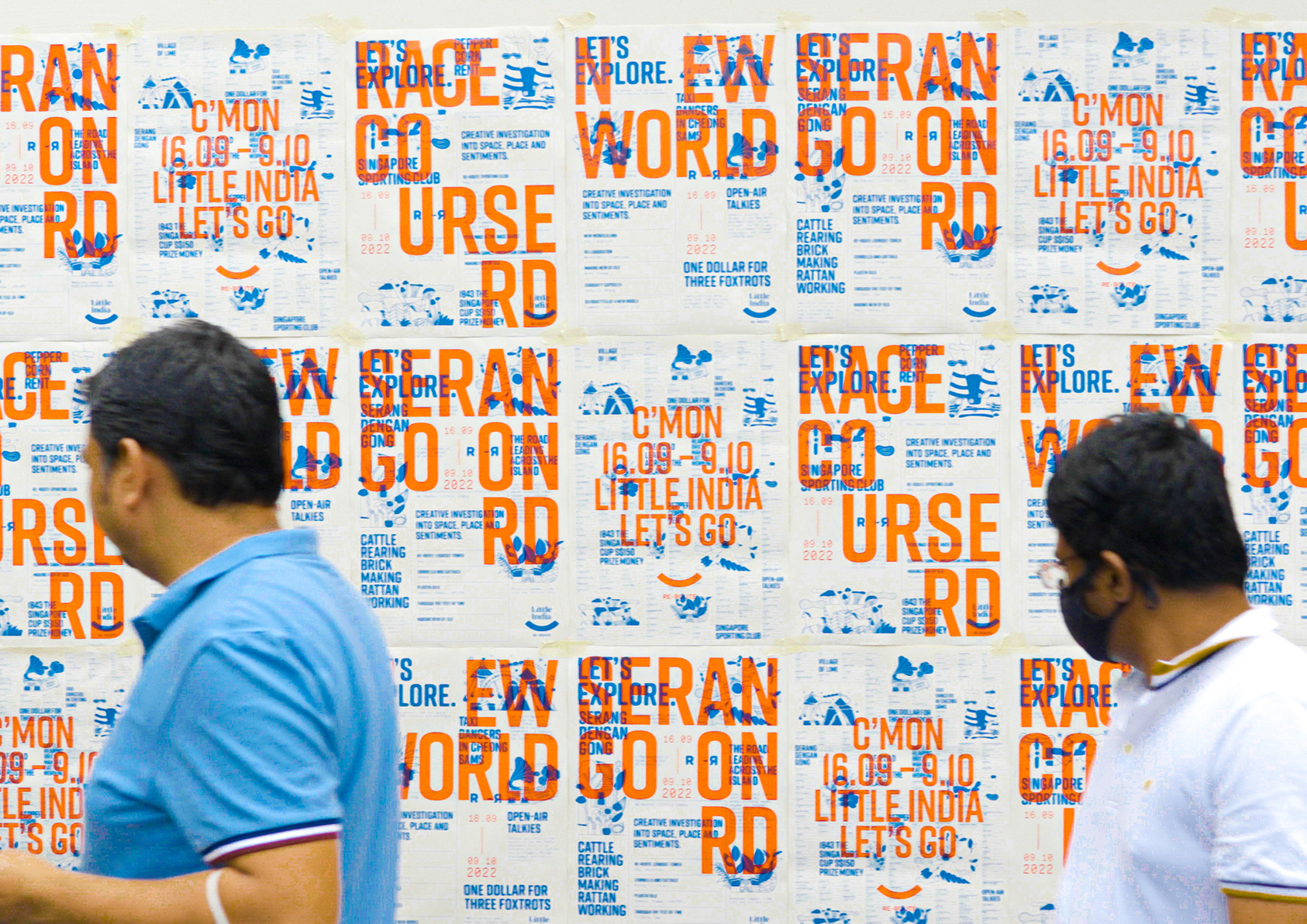
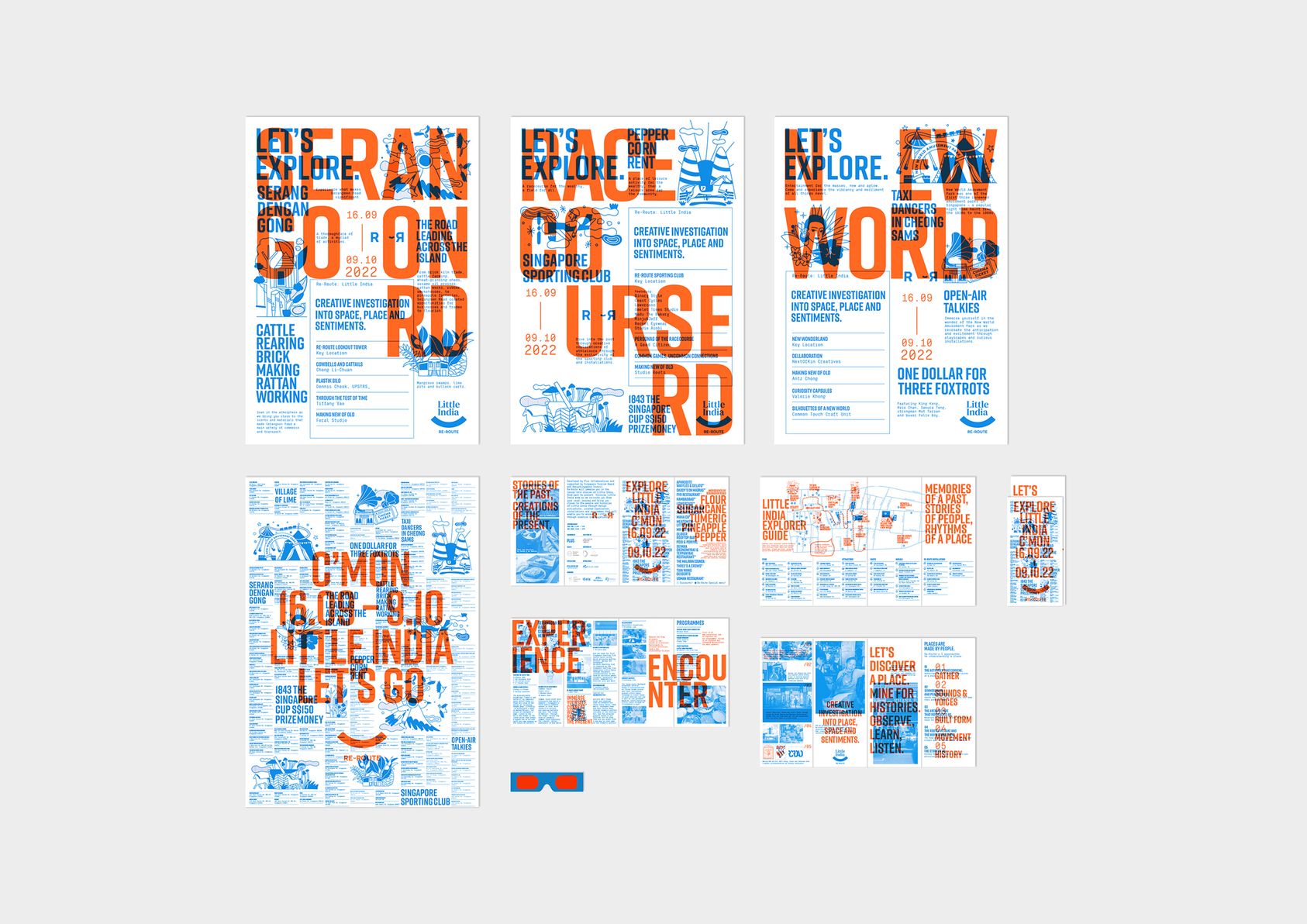
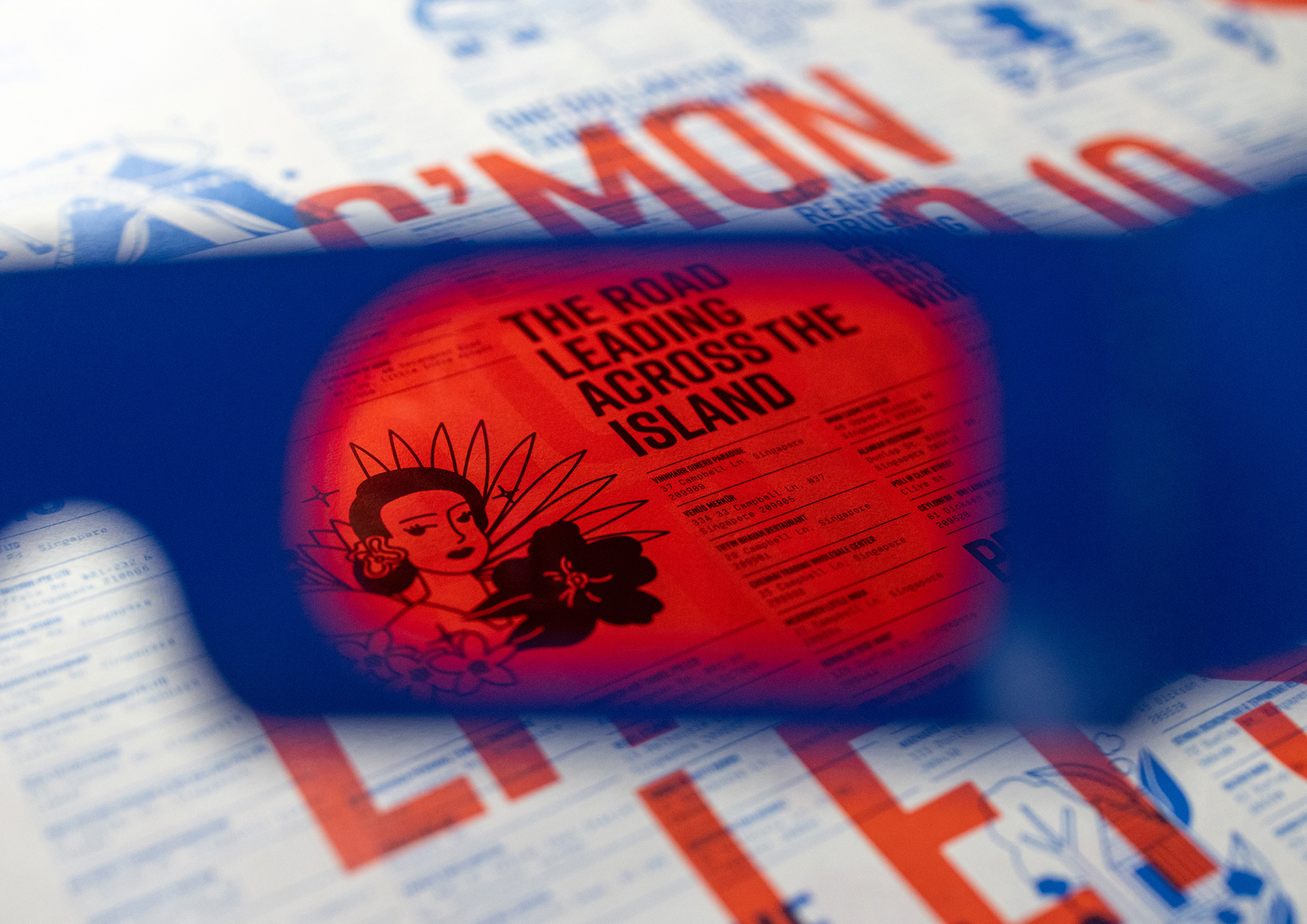
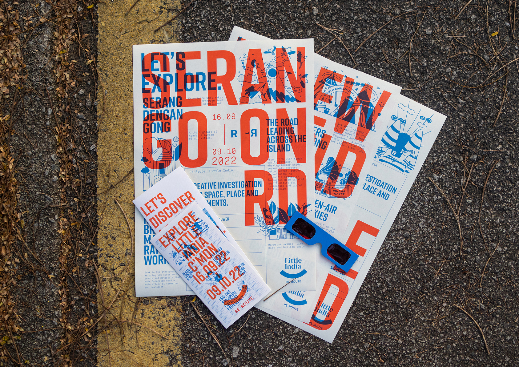
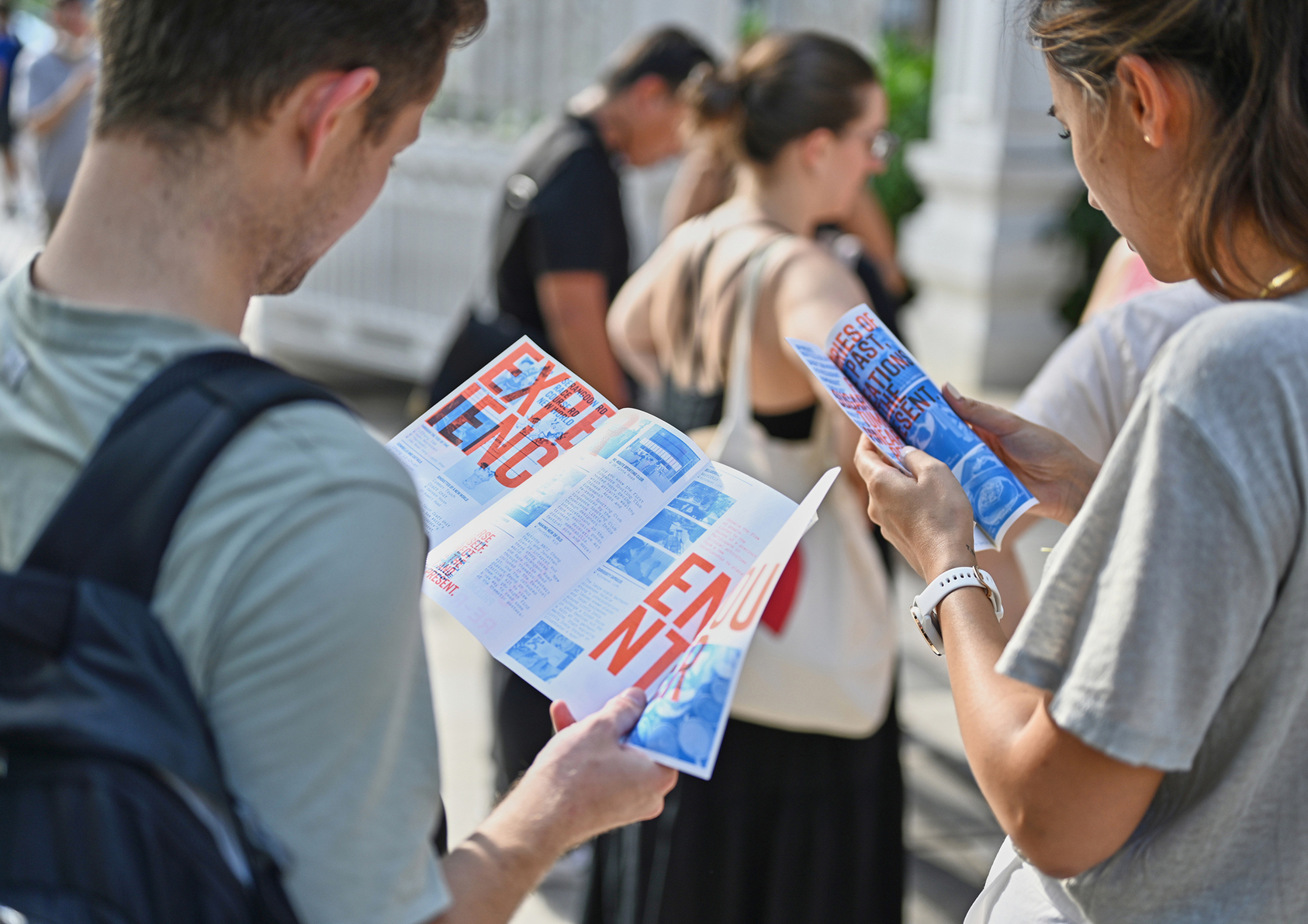
A reimagined set of collectibles at different zones and a navigational map was designed for Re-Route Festival as brochure to highlight the programmes and activations of the festival. Re-Route was a creative investigation of a place, commissioned by Singapore Tourism Board designed to motivate people to explore the overlooked areas by tourists which has a depth of culture to be explored.
The objective of the communication was to spark curiosity and engage people in digger deeper into the place, and in turn get exposed to the socio-cultural value Little India. The brochure applied the visual strategy of overlaying red and blue typography and illustration elements. Usable with red filter glasses, visitors to the festival are encouraged to don the glasses and look beyond the red punchy headers to the content in blue which houses details to discover about the site conveyed through illustrations, listings, headline that brings our snippets of stories from the past.
The format of a conventional brochure was challenged based on the objective of getting people to move across the site. The brochure for Re-Route Festival was conceptualised into a system and was broken down into separate sheets of collateral. A complete brochure would include 3 parts: a festival programme and happenings sheet to attract people’s attention through festival ongoings, a map to encourage exploration of the existing site offerings, and a series of 3 posters depicting the activations and heritage stories of 3 significant storycores to the site. These posters can only be picked up at their respective locations, encouraging visitors to move across the precinct to collect the full set of posters to complete the brochure set.