YOO BEER
-
CategoryCommunication Design
-
SubCategoryCorporate and brand identity
-
Applicant CompanyUnion Atelier / Taiwan
-
Manufacturer / Business OwnerYOO BEER / Taiwan
-
Design CompanyUnion Atelier / Taiwan
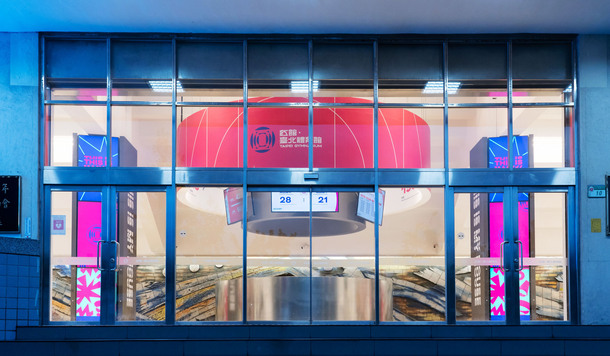
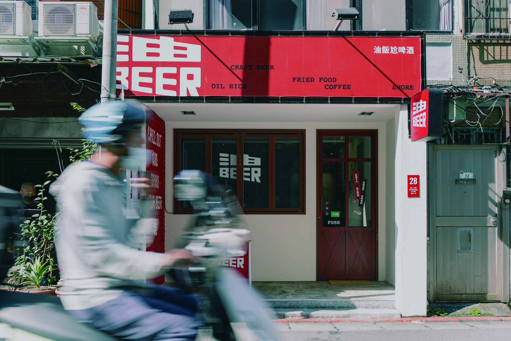
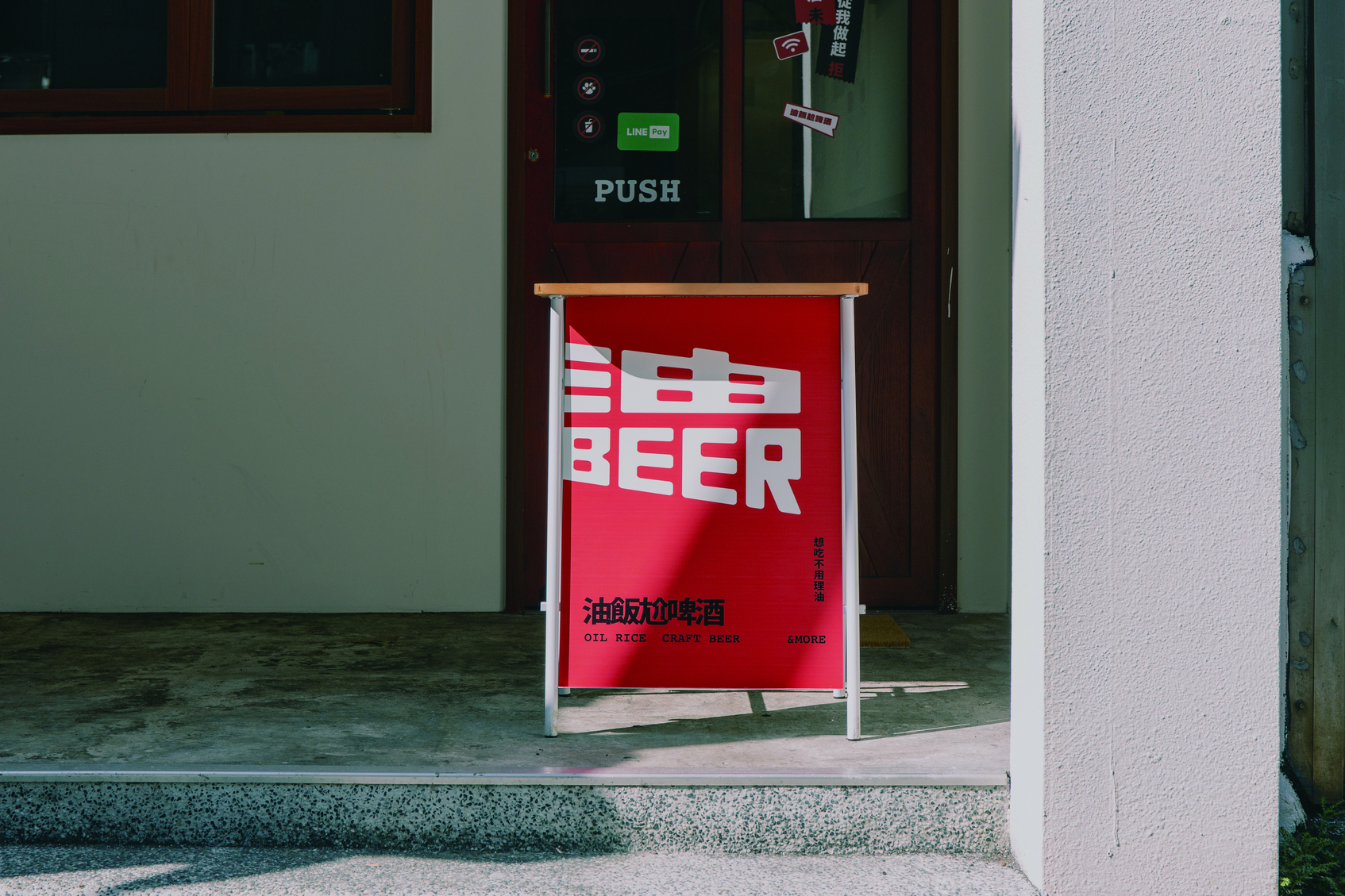
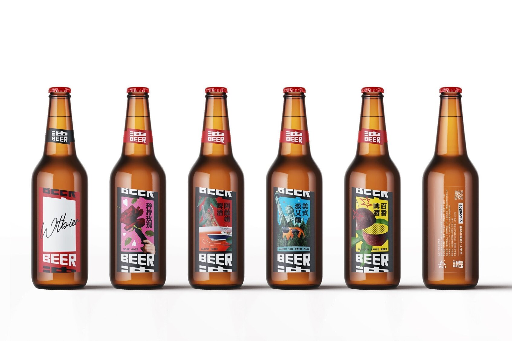
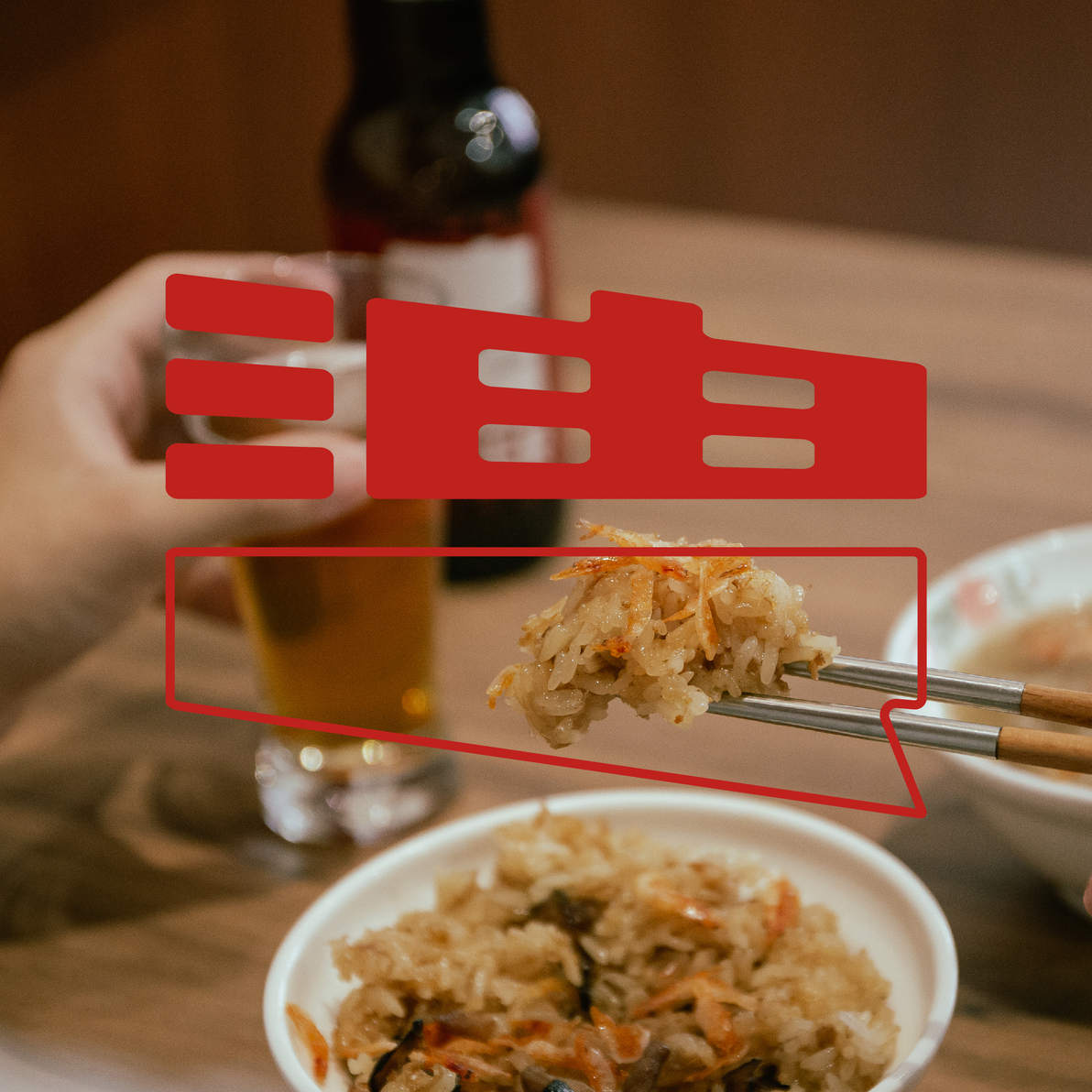
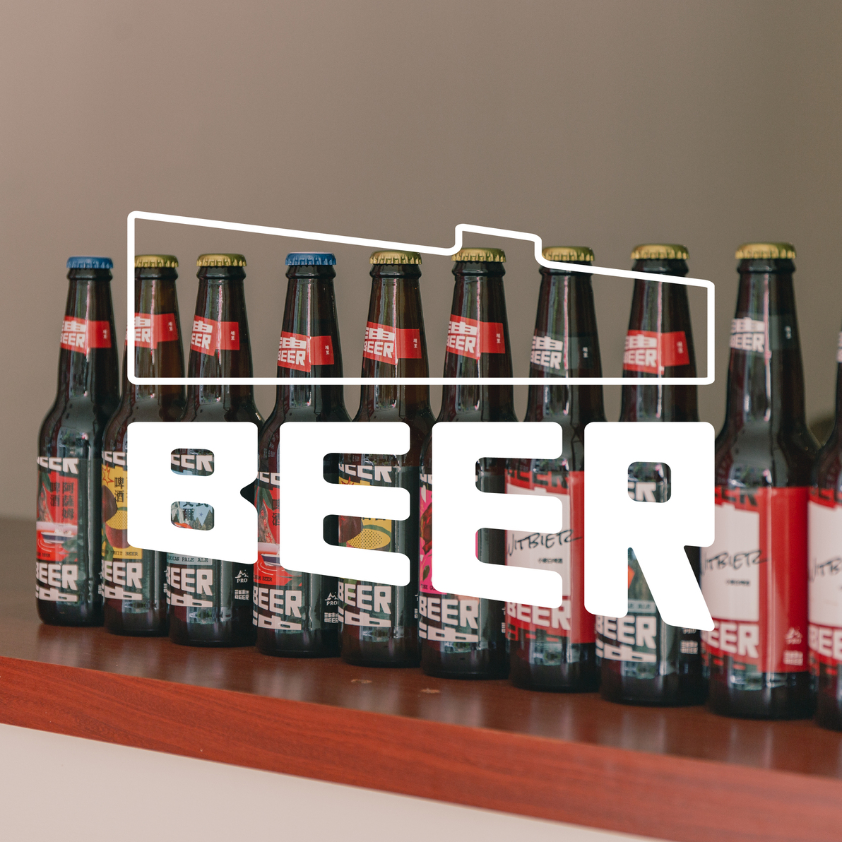
YOO BEER is a restaurant brand of oil rice and beer. The distinct oil rice and carefully brewed beer create a Taiwanese flavor in the combination of food and drink, representing the inseparable relationship between the two. Thus, the perfect ratio of 1:1 was used as the core concept in the logo design, deconstructing and reconstructing the brand name into the imagery of oil rice and beer. This symbolizes how oil rice and beer complement each other as the main characters, and usage scenarios, creating different forms for the logo representing oil rice and beer respectively, guiding the audience to associate the brand visually. In addition, based on the symbolic representation of oil rice in Chinese banquet culture, the brand’s visual vocabulary also extends to Chinese banquet culture, incorporating elements such as the round table into the design of the key visual, creating a brand context that resonates with the public. The branding of YOO BEER revolves around oil rice and beer, with the perfect ratio of 1:1 proportion of the two represented in the logo and combined with Chinese banquet culture, aligning with the brand strategy of a local and lifestyle-oriented brand positioning.