Beyond Color: How Manita Songserm Redefines Contemporary Thai Graphic Design
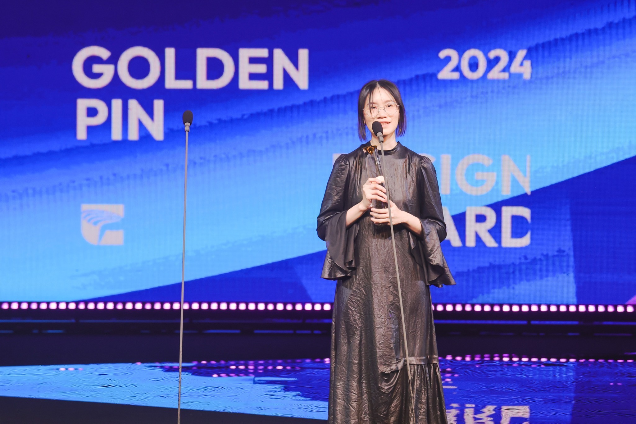 2024 Manita Songserm receiving Best Design of Golden Pin Design Award for the exhibition key visual of “Crossover II: The Nature of Relationships”, and delivered her acceptance speech at the award ceremony.
The approach was recognized internationally when her visual identity for Crossover II: The Nature of Relationships, an exhibition at the Bangkok Art and Culture Centre (BACC), received Best Design Award at Golden Pin Design Award in 2024, the first time a Thai designer has won the top honor in communication design.
A Thai Designer on the International Stage Through a Distinct Visual Language
Born in 1990, Manita Songserm (มานิตา ส่งเสริม, nickname Mai) graduated from the Faculty of Fine and Applied Arts at Chulalongkorn University. She later joined BACC as an in-house designer, where she developed a consistent yet evolving visual language across exhibitions.
“Many people think my style is defined by the typefaces I use and how they’re selected and arranged,” Manita said. “But for me, it’s about staying open, taking in everything I’m interested in at that moment, and combining it with a sense of structure on design, often through symmetrical grids”.
In 2019, before turning 30, Manita was elected to the Alliance Graphique Internationale (AGI), positioning her as one of the most prominent figures of Thailand’s new generation of graphic designers and bringing her work into global design discourse.
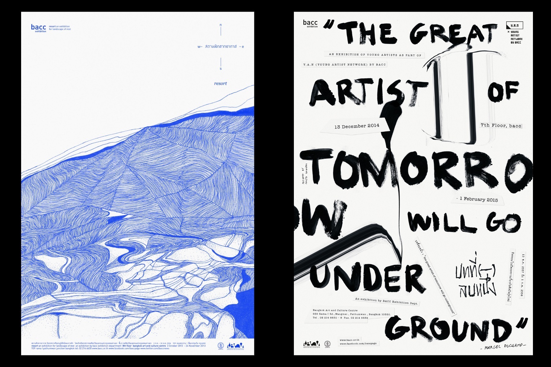 (The left) 2013 “RESORT An Art Exhibition for Landscape of Rest”, Bangkok Art and Culture Centre; (the right) 2014 “(-)1 : The great artist of tomorrow will go underground”, Bangkok Art and Culture Centre (Photo courtesy of Manita Songserm)
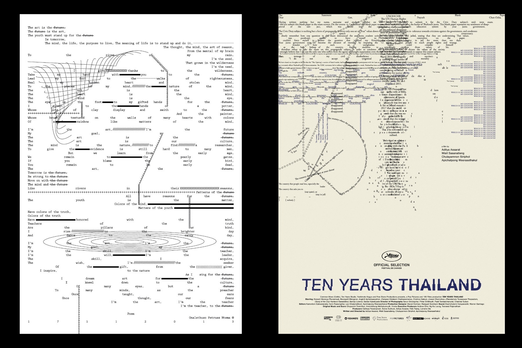 (The left) 2014 Personal work by Manita Songserm; (the right) Poster for “Ten Years Thailand” (Photo courtesy of Manita Songserm)
Typography, Structure, and the Challenges of Bilingual Design
Each year, BACC launches the Early Year Project, a platform dedicated to emerging artists. As an in-house graphic designer, Manita is tasked with developing a new visual identity annually, working within the same exhibition framework while reinterpreting different themes and artistic practices.
Through her ongoing exploration of typography, symmetrical grids, and structural systems, Manita consistently generates fresh visual outcomes.
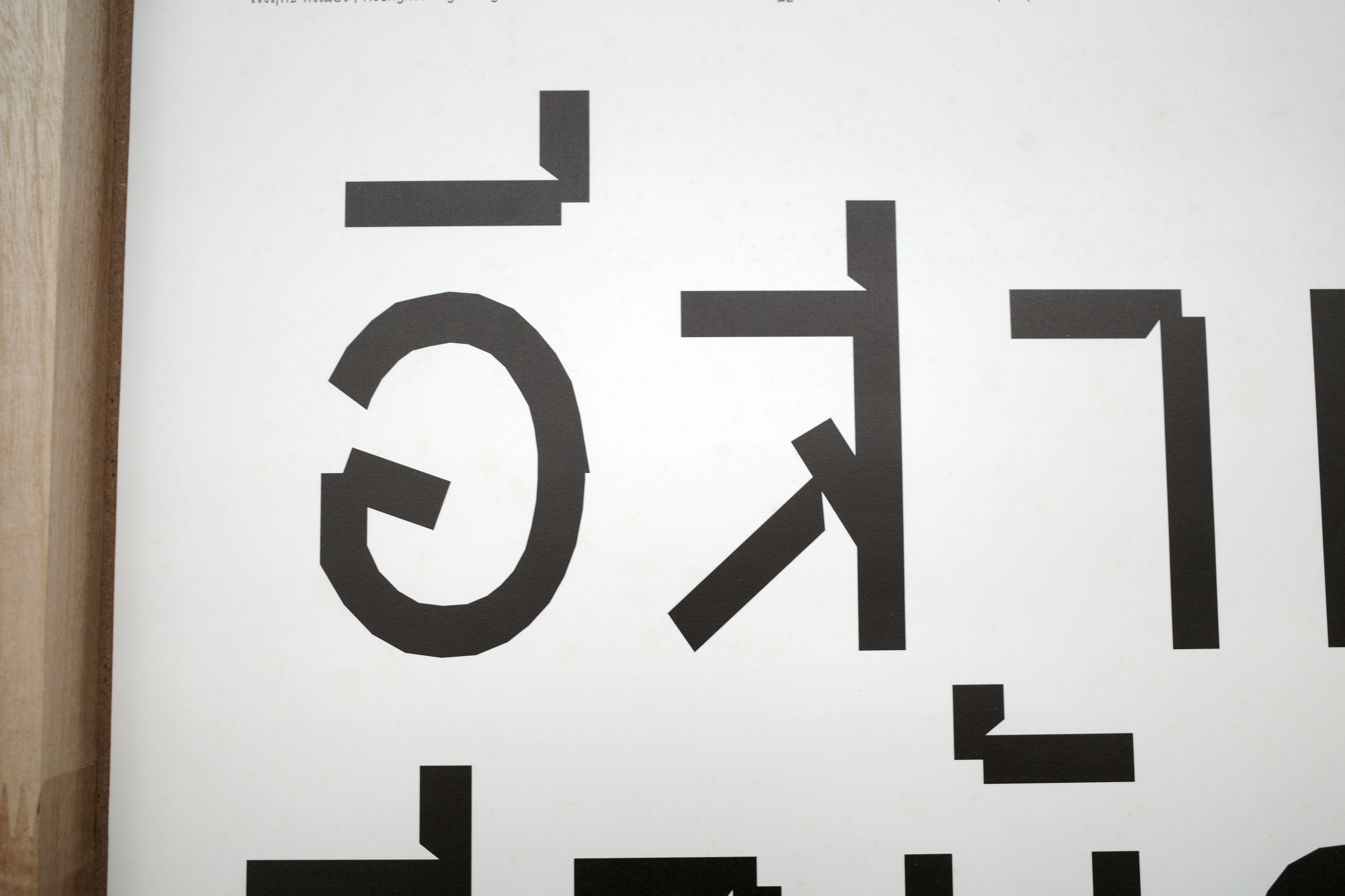
Working within the exhibition's bilingual environment, Thai and English, plays a crucial role in her work. “Thai and English typefaces behave very differently. Their spacing, rhythm, and emotional tone are not the same,” she explained. Rather than treating these constraints as limitations, she sees them as creative openings. “In some cases, the Thai text might not even function primarily as readable language, but as a visual and aesthetic element.”
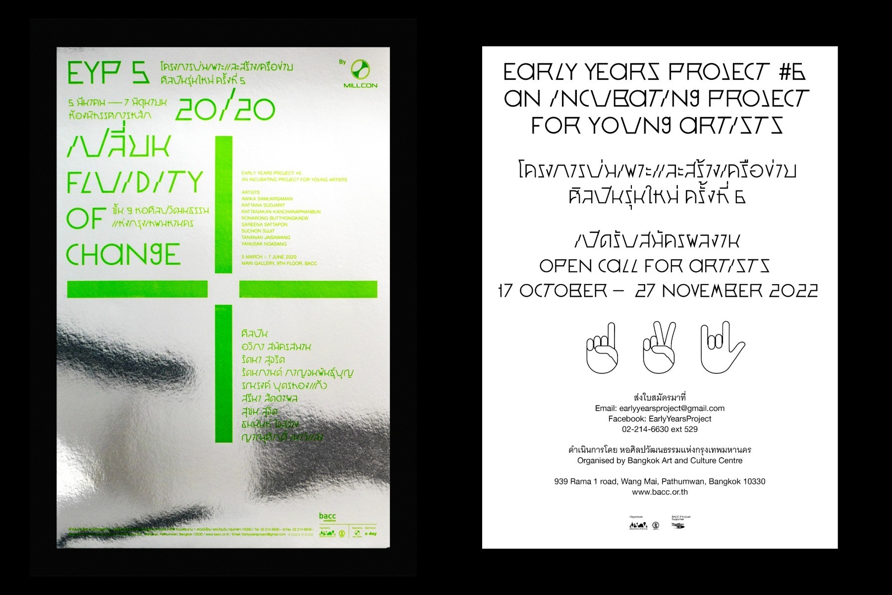 (The left) Key Visual of 2020 “Early Year Project”; (the right) Key Visual of 2020 “Early Year Project” (Photo courtesy of Manita Songserm)
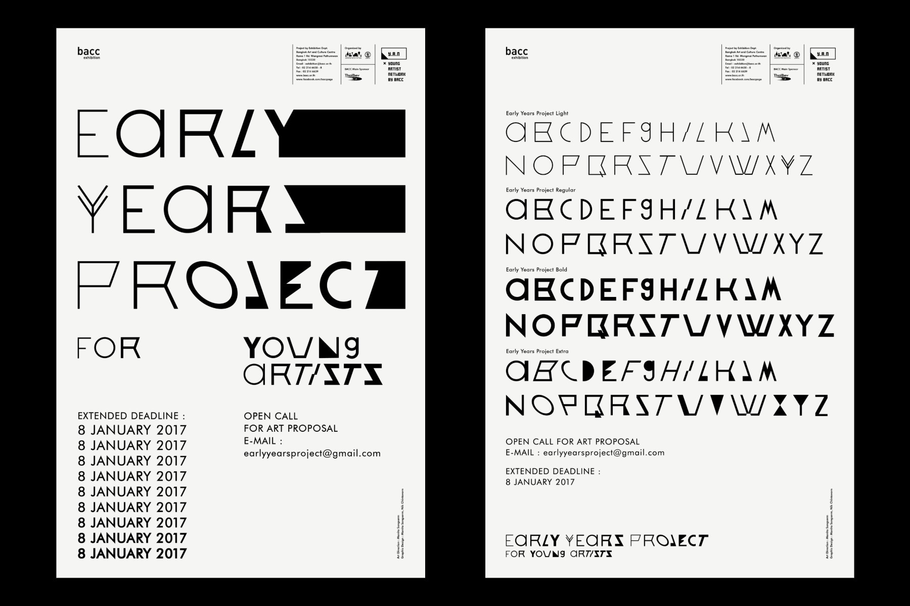 (The left) Key Visual of 2017 “Early Year Project”; (the right) Key Visual of 2017 “Early Year Project” (Photo courtesy of Manita Songserm)
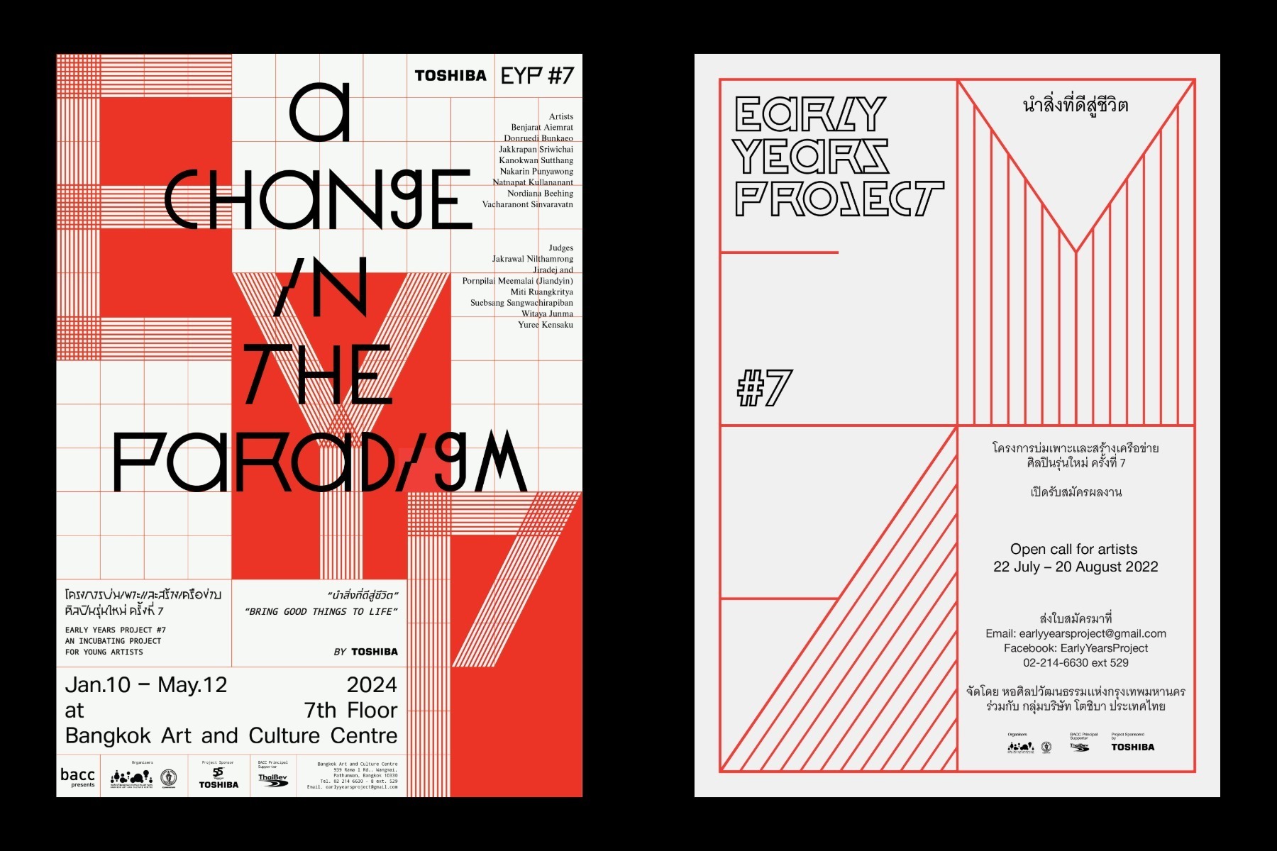 (The left) Key Visual of 2024 “Early Year Project”; (the right) Key Visual of 2024 “Early Year Project” (Photo courtesy of Manita Songserm)
Manita’s experiments extend beyond written language itself. In the 2024 edition of Early Year Project, titled IN COGITATION, she introduced sign language as a graphic system. Eight different hand gestures were translated into a series of posters that could be interpreted regardless of linguistic background, expanding communication beyond words.
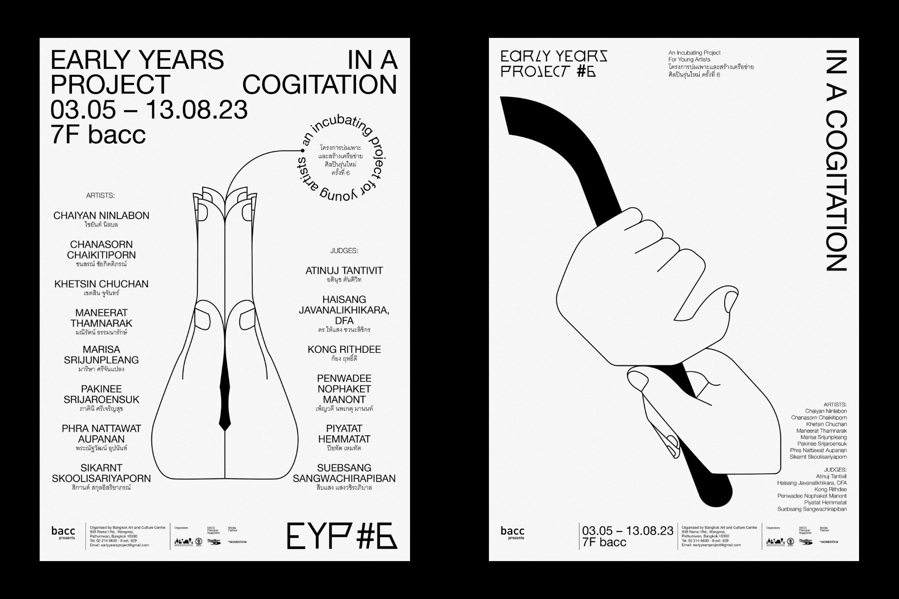 (The left) Key Visual of 2023 “Early Year Project” ; (the right) Key Visual of 2023 “Early Year Project” (Photo courtesy of Manita Songserm)
Connecting the 20th Century and the Digital Present: Crossover II: The Nature of Relationships
Good design is not only about visual novelty or aesthetic refinement, it opens a dialogue between content and audience, and sometimes even invites participation. Manita’s award-winning work for Crossover II: The Nature of Relationships demonstrates how design can reshape the way audiences encounter history.
During the pandemic, BACC was unable to bring in international artworks. It turned inward instead, assembling the collection of Thai paintings from private collectors, dating from 1945 to 2000, spanning from post-World War II to the Asian Financial Crisis.
Next, the challenge became: how could historical oil paintings speak to contemporary viewers?
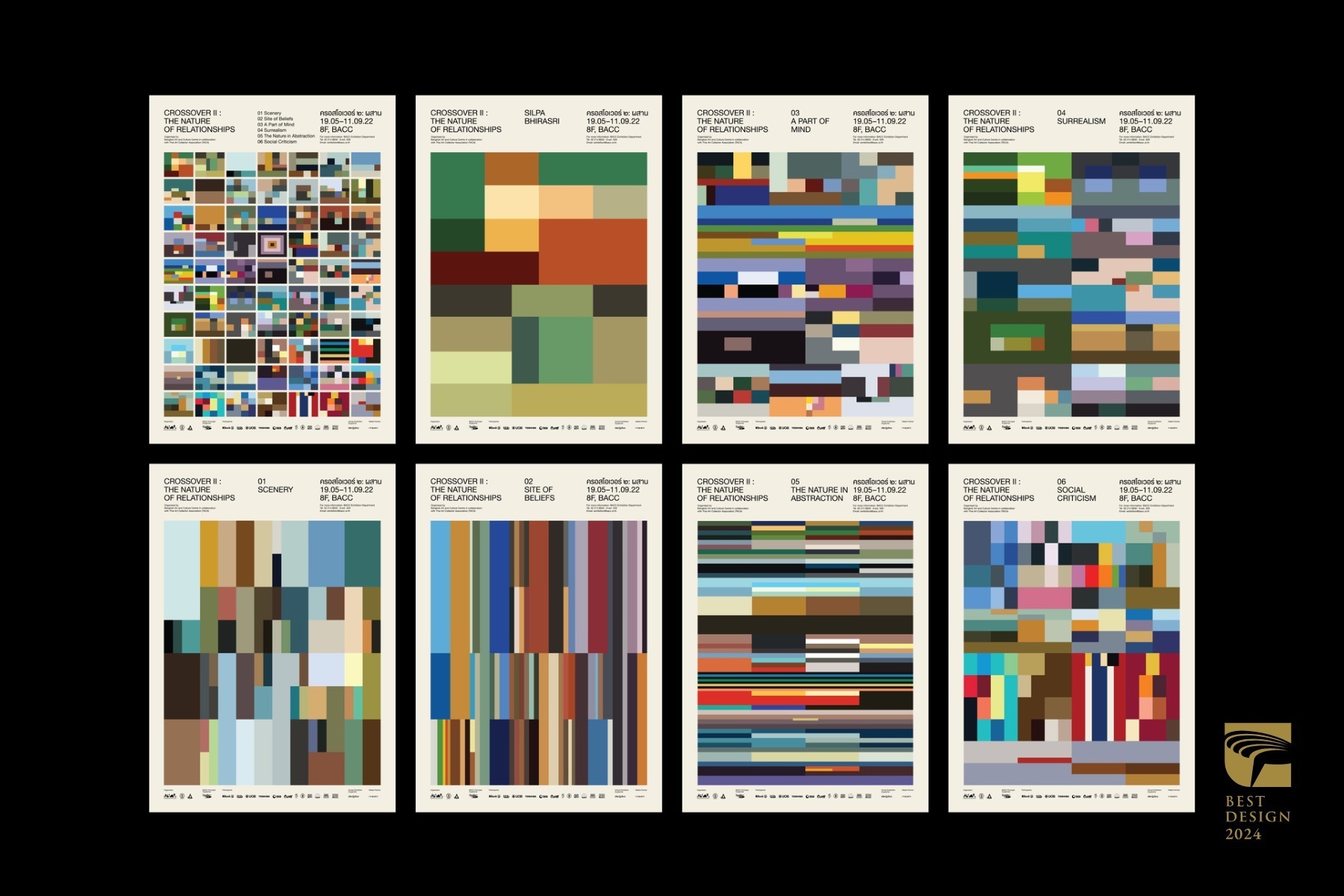 Key Visual of Exhibition “Crossover II: The Nature of Relationships”, Bangkok Art and Culture Centre.
疫情期間,由於曼谷藝術文化中心無法引進國際藝術品展出,因而向泰國國內藏家收集了 1945 至 2000 年間的泰國藏畫,策劃《Crossover II: The Nature of Relationships》展覽,呈現泰國從二戰到亞洲金融風暴期間的 20 世紀油畫風貌。然而,如何吸引新世代觀眾對於「上一代的油畫」產生興趣,成為了展覽宣傳的課題。
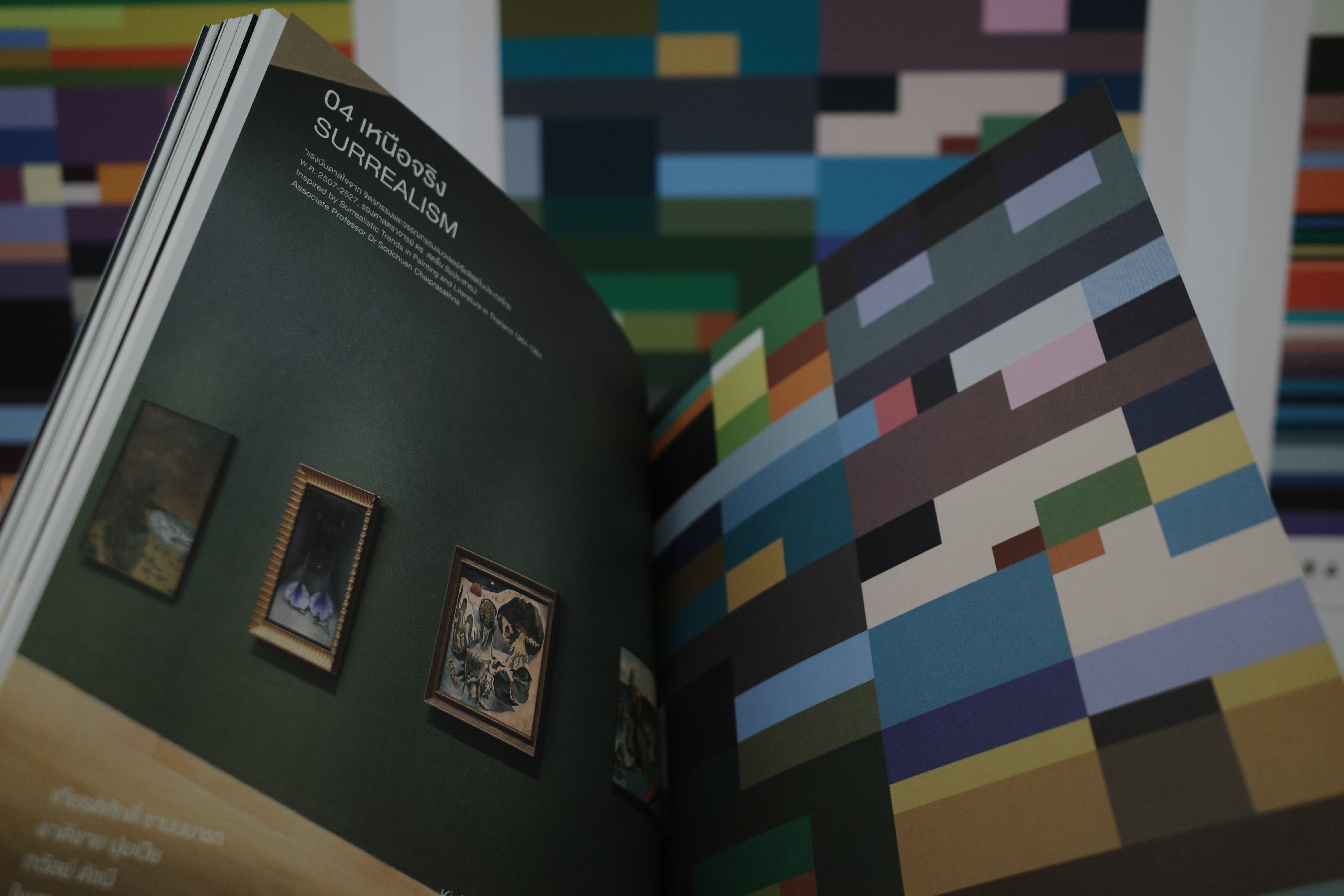 Exhibition booklet for “Crossover ll: The Nature of Relationships” (photo courtesy of Wang, Hsien-Tzu)
Manita’s response was not to show the paintings directly. Instead, she extracted all 70 artworks’ base colors and translated them into pixelated color palettes, which further became the exhibition’s key visual. Viewers encounter color first, artworks second. The design delays recognition, encouraging curiosity and interpretation from the audiences.
“These colors carry the atmosphere of a specific time,” Manita reflects. “It’s something that can’t truly be replicated today.” By reducing paintings to pure color palettes, she connected analog visual memory with digital perception, bridging past and present through abstraction.
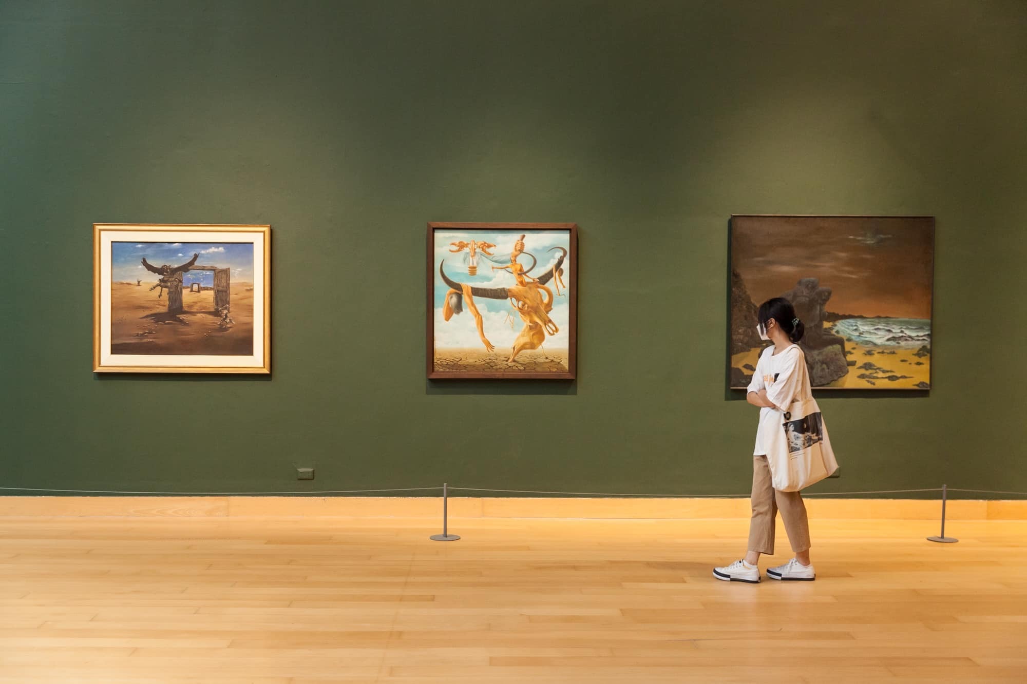
 “Crossover II: The Nature of Relationships” Exhibition(photo courtesy of Bangkok Art and Culture Centre)
A Non-Typical Thai Design Between Chaos and Order
“It’s true—when people think of Thai design, they think of color. I see it every day too, so I get it,” Manita said. Yet her work moves away from this expectation.
In projects such as an exhibition on Thailand’s northeastern Isan region, where vivid colors are often assumed to be the core element, Manita instead drew from local lifestyle and craft traditions. She then developed typographic forms inspired by bamboo craftsmanship, resulting in a visual language that felt both neat but deeply rooted in place.
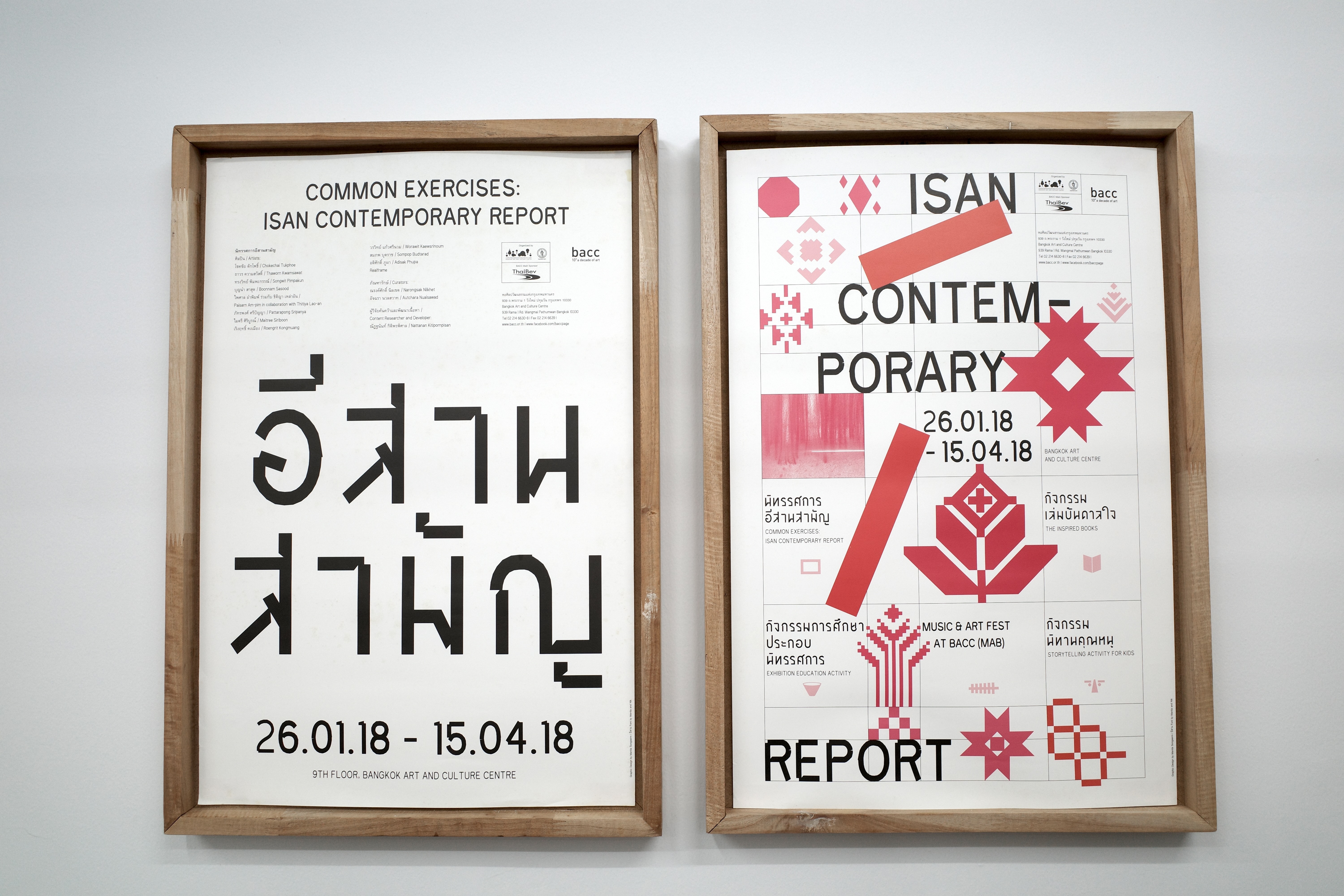 Key visual of 2018 “Common Exercises: Isan Contemporary Report”, Bangkok Art and Culture Centre (photo courtesy of Wang, Hsien-Tzu)
 Key visual of 2018 “Common Exercises: Isan Contemporary Report”, Bangkok Art and Culture Centre (photo courtesy of Wang, Hsien-Tzu)
“My work reflects both my personality and my lived experience,” she explained. “I’m surrounded by chaos, contradiction, and intensity, but also structure, rules, and pressure. That tension makes me want to bring a sense of order into my design.” Her projects become fields of experimentation, where global influences, local inspirations, and personal perception intersect.
Through this ongoing balance between chaos and order, Manita constructs a visual language that challenges fixed ideas of Thai design. Rather than defining Thai design, she reframes how it can be seen. Through her experimental work, it moves beyond color, becoming an evolving system shaped by perception and interpretation.
—————
Interview & Text: Ellen Wang (Wang, Hsien-Tzu)
This article is also published on Very Mulan, a media partner of the Golden Pin Design Award.

